JERSEY MIKE’S PROJECT
Project Duration
11 weeks
My Role
As this was a school group project, I was actively involved in every stage of the design process. My responsibilities included conducting user research, analyzing pain points, developing user flows, creating wireframes and high-fidelity prototypes, performing usability testing, and iterating on designs based on feedback. I collaborated closely with classmates, contributing to both the creative direction and technical execution of the project.
Tools Used
Figma, Maze, Miro, Canva etc.
Project Goal
Reimagine the Jersey Mike’s mobile app to streamline the ordering process, improve accessibility, and modernize the interface.
Project Overview
- Completed as part of a UX/UI course.
- Focused on building a more intuitive and enjoyable user experience.
- Applied user research to identify pain points and opportunities.
- Conducted multiple design iterations to refine layouts and flows.
- Used usability testing to validate improvements and guide final design decisions.
Key Objectives
- Redesign the menu layout and navigation (including cart placement) to create a streamlined, visually appealing checkout process that encourages higher sales.
- Enhance the customization process for menu items to make it faster and more user-friendly.
- Optimize the payment process to ensure smoother and more reliable transactions.
PERSONA

JOURNEY MAP

VALUE PROPOSITION MAP

COMPETITIVE ANALYSIS

IDEATION


PAIN POINTS
Pain Point 1: No guest checkout ordering delivery

Pain Point 2: Difficulty locating the “My Cart” button

Pain Point 3: Menu

Pain Point 4: Lack of payment options

Pain Point 5: Lack of features to engage users

LOW FIDELITY PROTOTYPE

HIGH FIDELITY PROTOTYPE

USABILITY TESTING


Conclusion
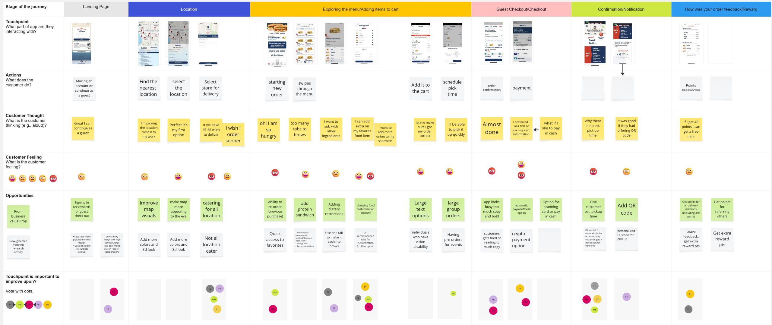
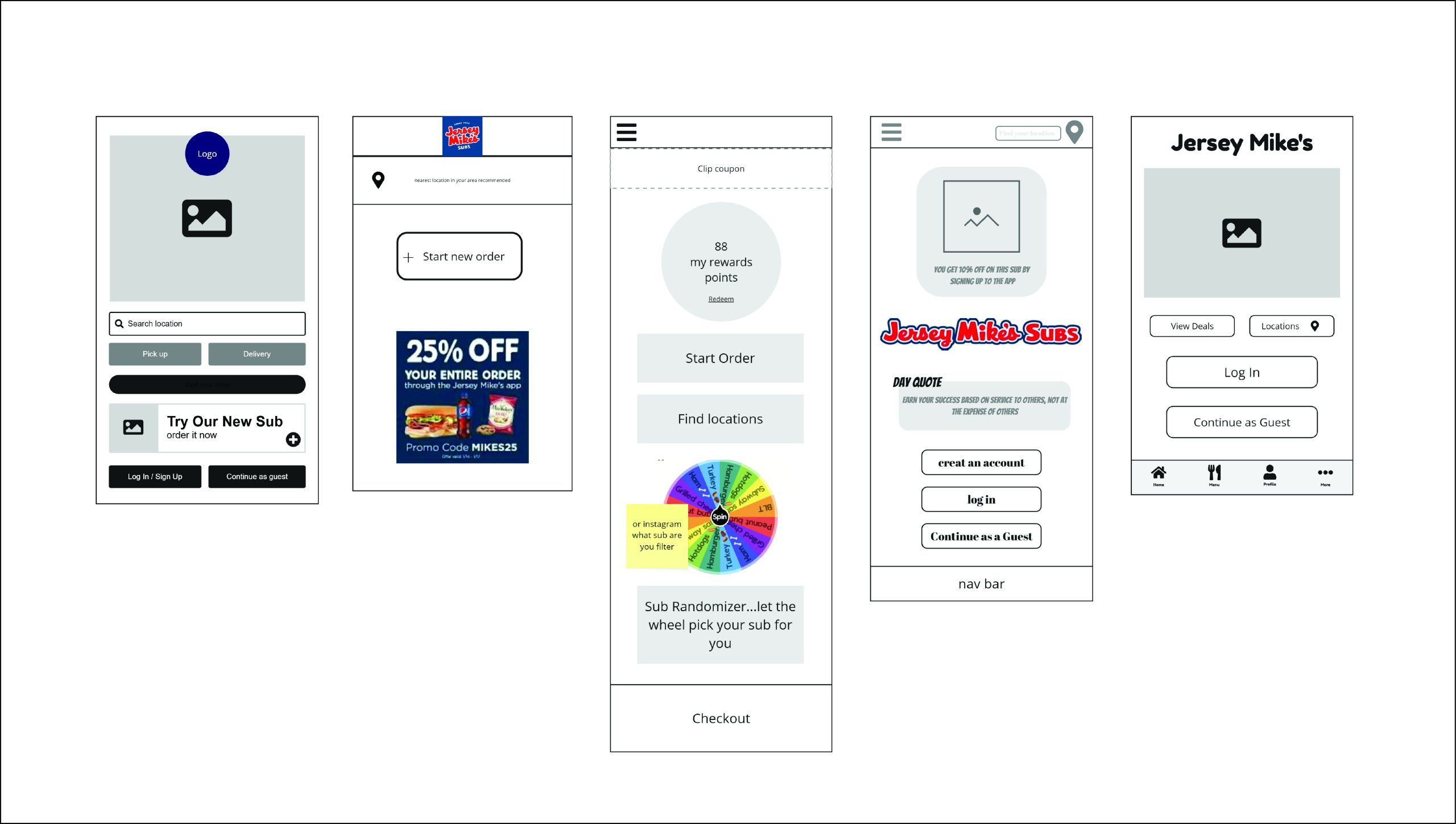
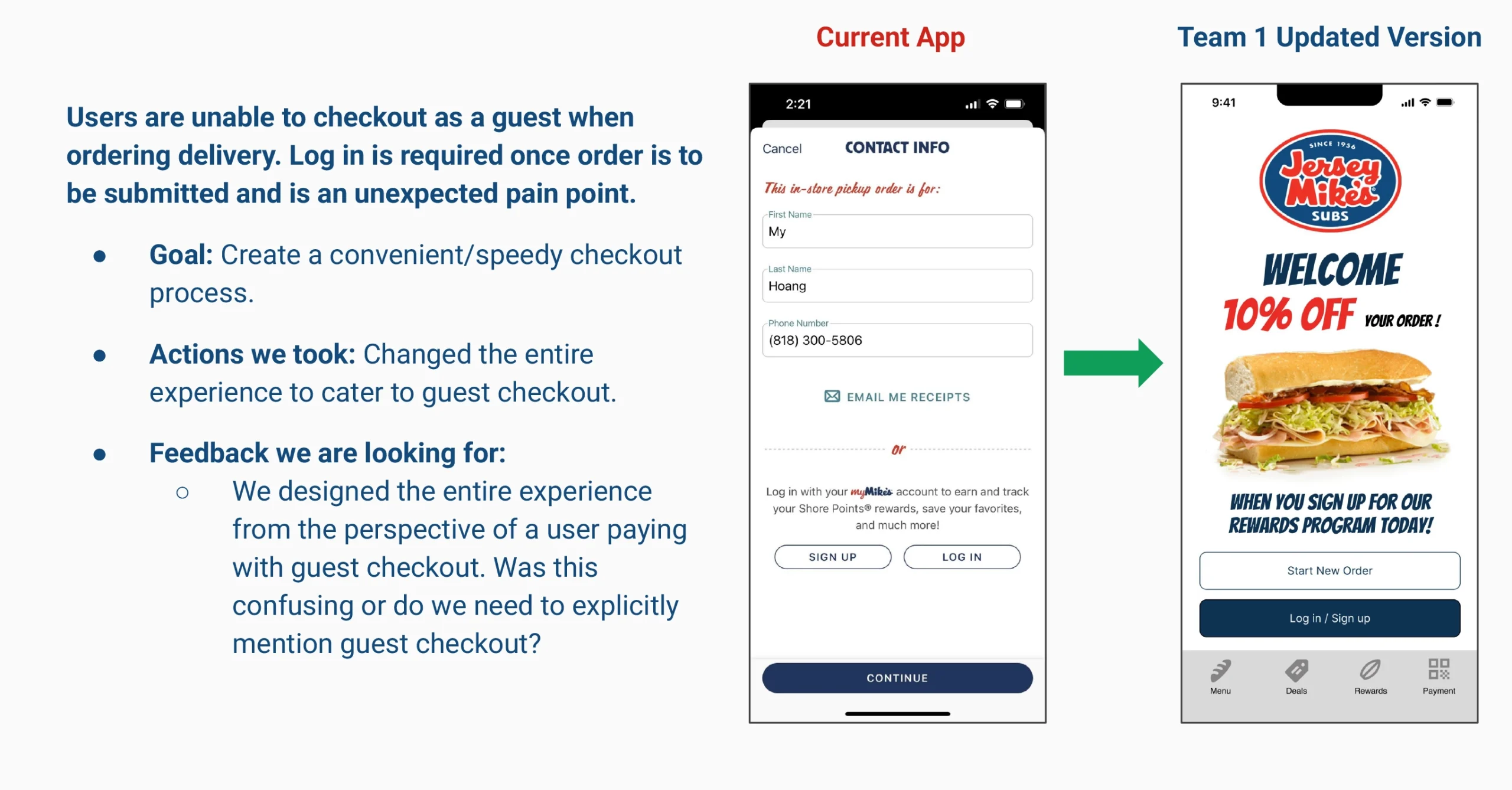
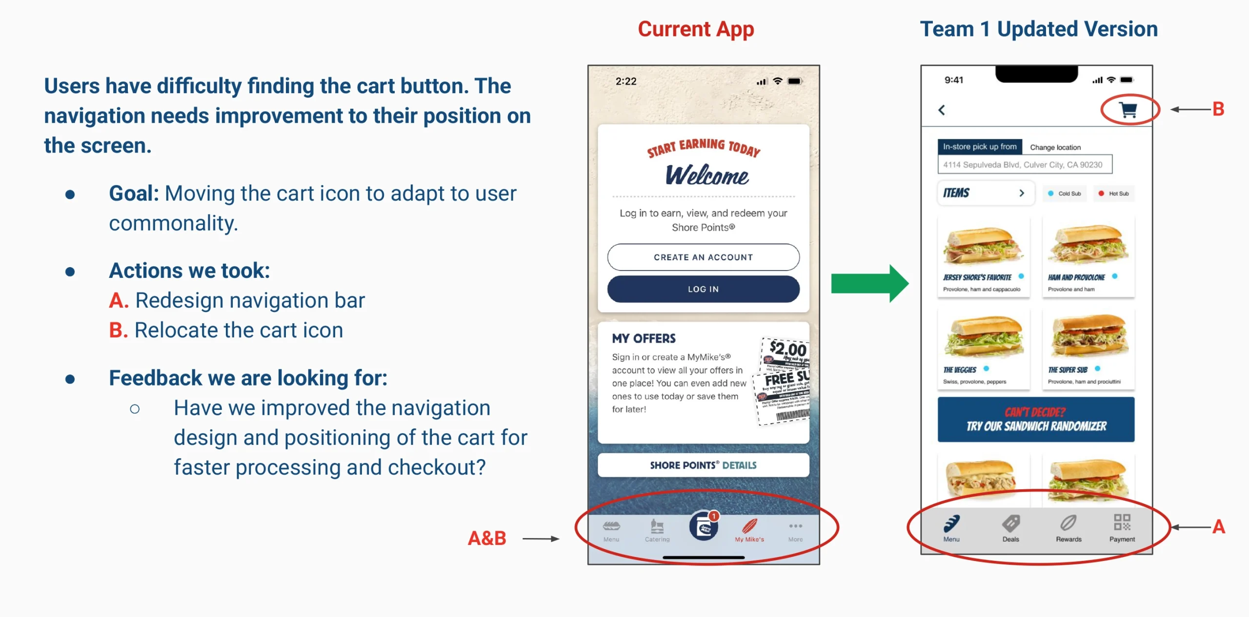
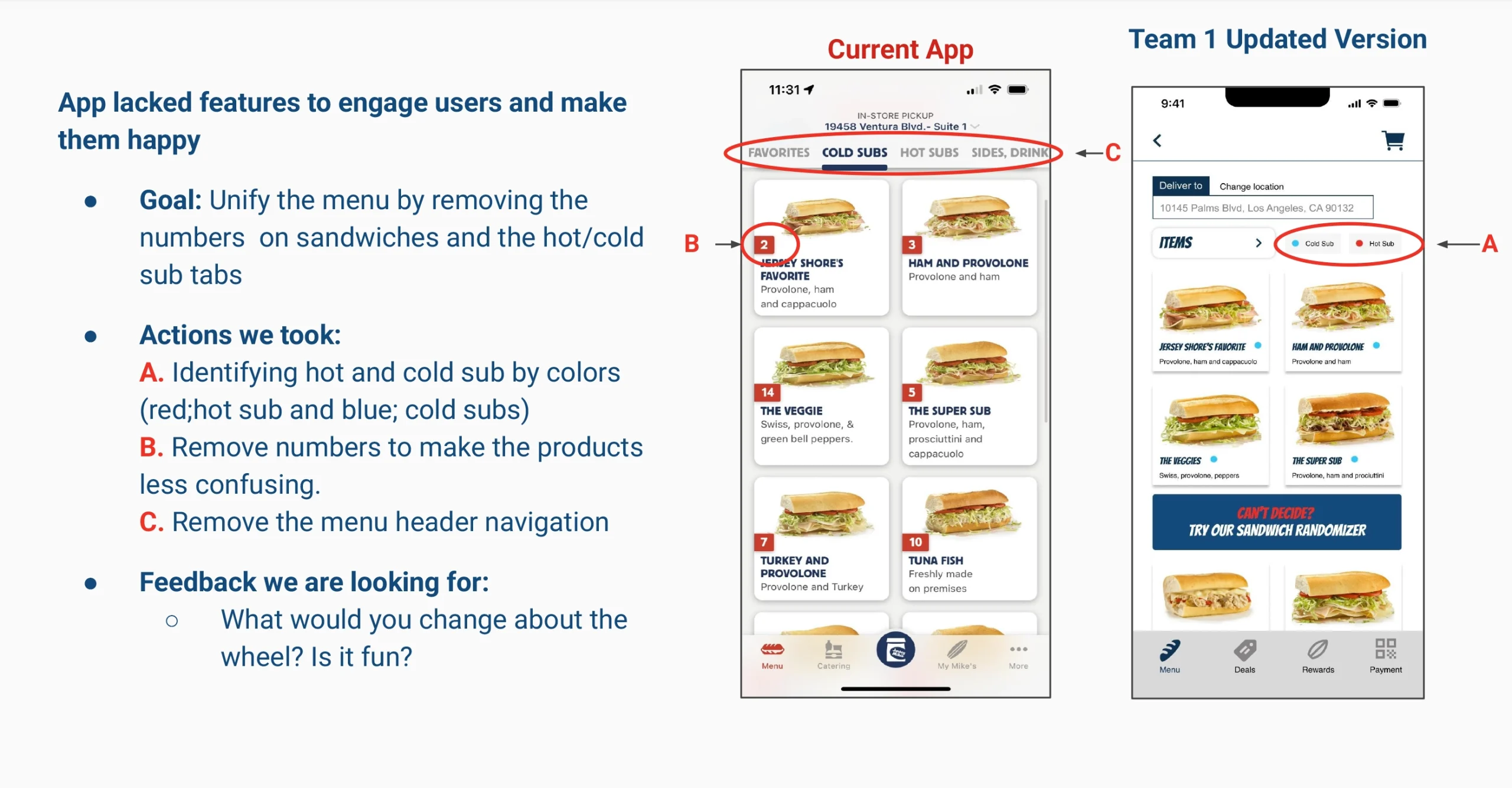
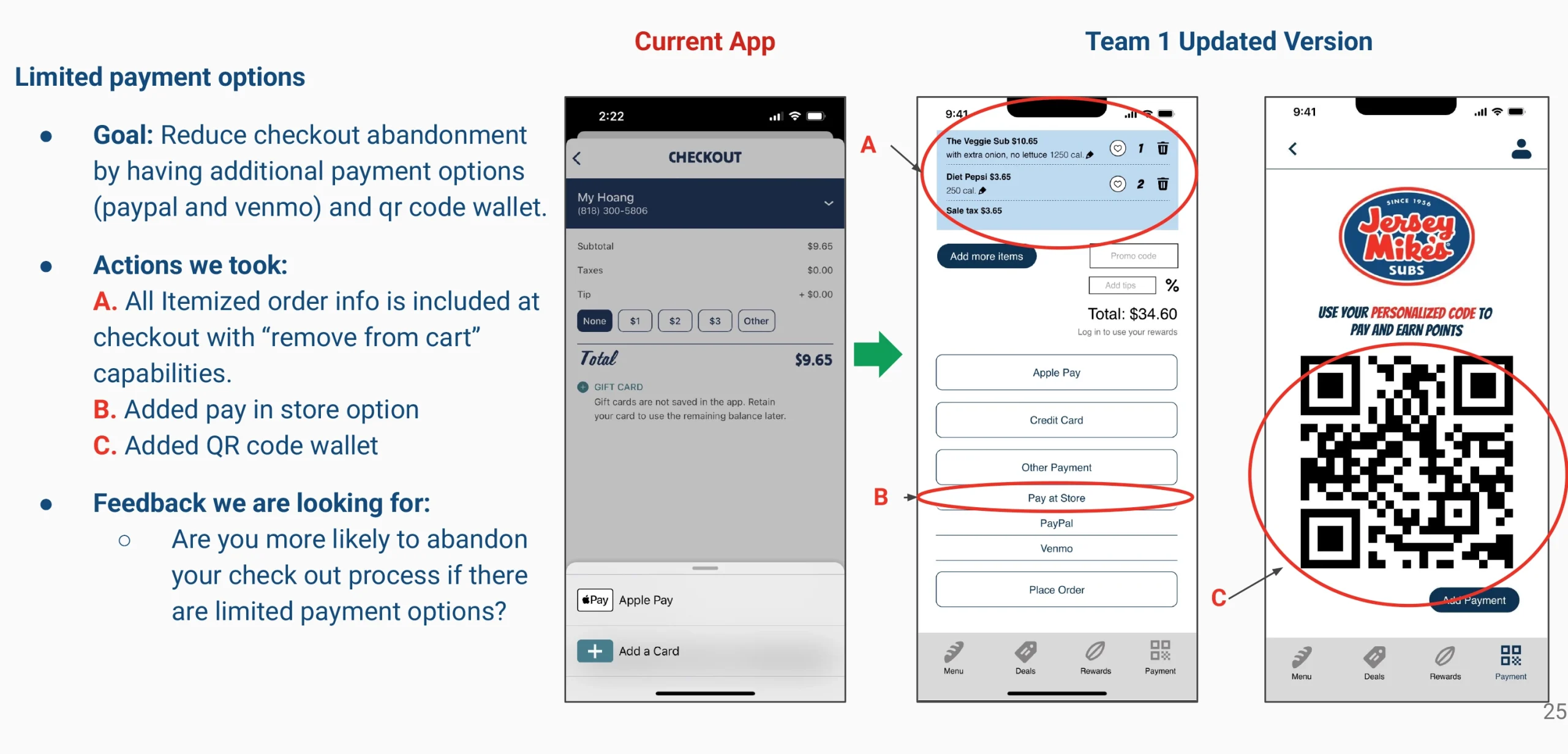
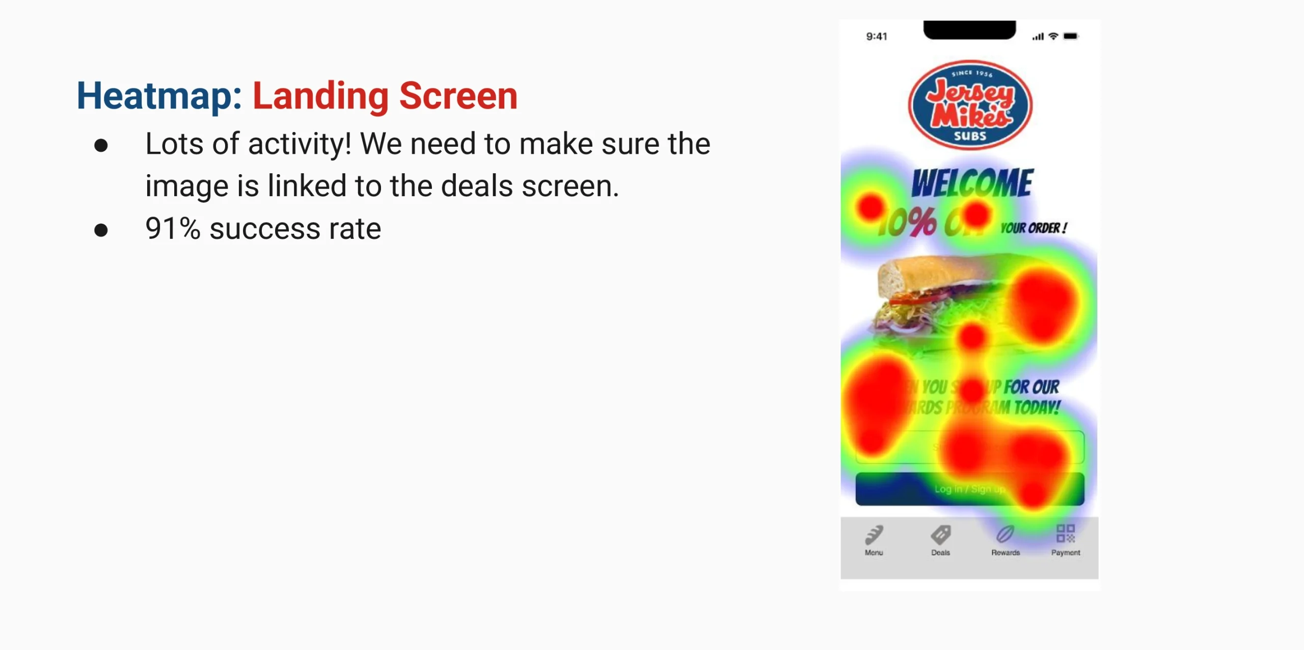
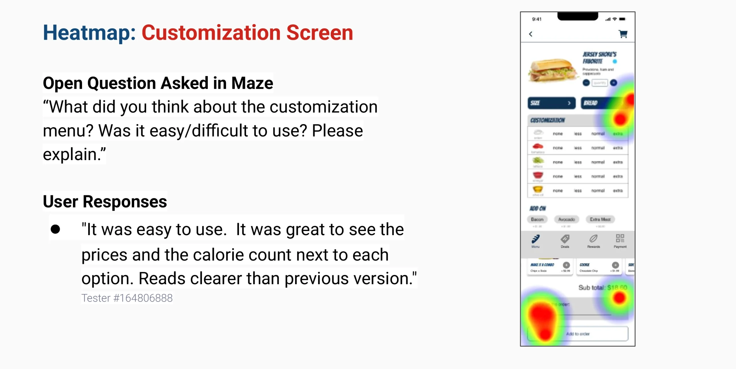
Through multiple rounds of usability testing and peer feedback, we gained valuable insights into user preferences and pain points. We identified key improvements such as simplifying account creation with a guest checkout option, optimizing icon placement in navigation menus, and allowing more precise customization of menu items. Gamification elements, like the interactive wheel, were well-received and added a fun touch to the experience. However, we also discovered usability issues, particularly with CTA buttons placed below the screen frame, which caused drop-offs during testing. Addressing these placement issues and improving scrolling intuitiveness will be essential for smoother user flow. Moving forward, we will refine our wireframes, test updated prototypes in Maze, and continue iterating to ensure a seamless and engaging user journey.