DOLLAR SHAVE CLUB PROJECT
Project Duration
11 weeks
My Role
As this was a school group project, I was actively engaged in all stages of the design process. My responsibilities included conducting research, creating personas, journey maps, empathy maps, user flows, design systems, and mockups. I worked closely with my classmates to exchange ideas, solve design challenges, and ensure our project aligned with user needs.
Tools Used
Miro for the sprint, Google slide to gather all my research and organize my project, Figma to prototype, Maze for user usability testing.
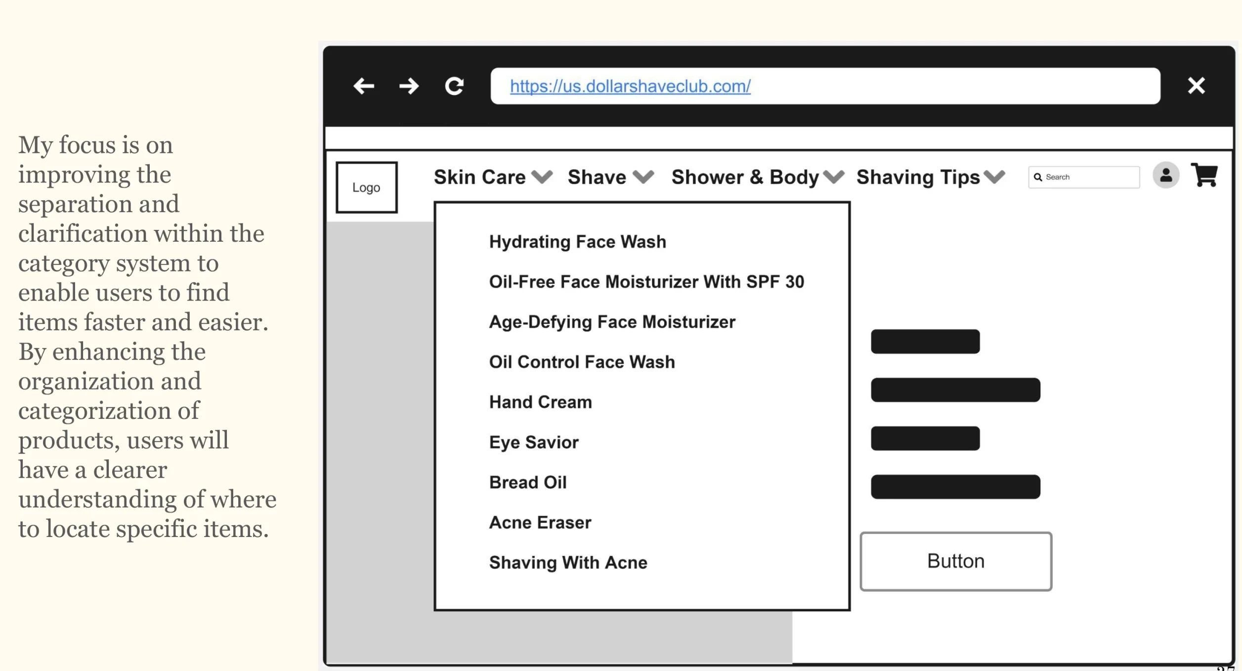
Project Goal
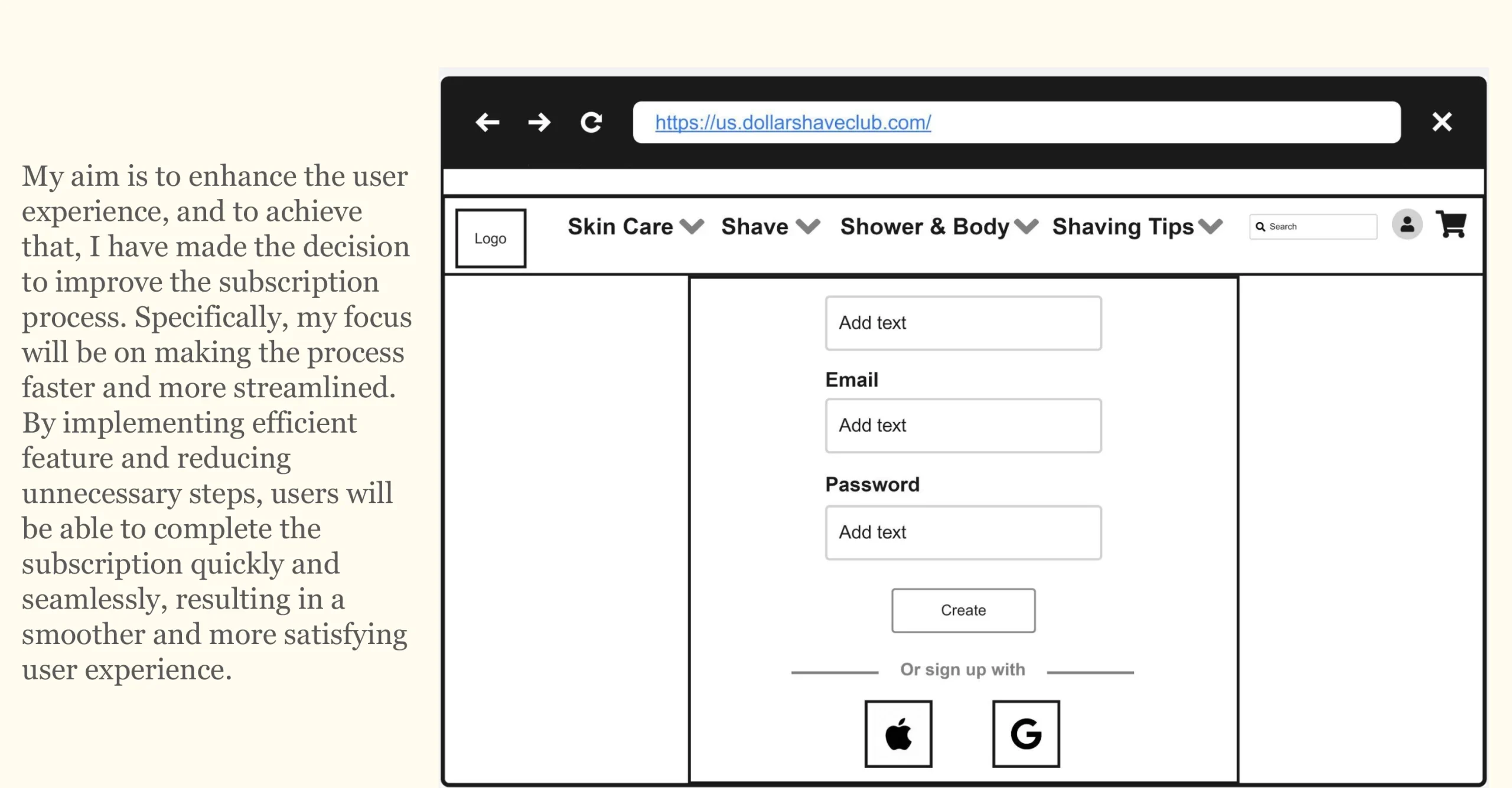
My goal is to ensure that users can easily access and navigate through the website and also streamline and optimize the interface to increase efficiency and expedite the customer journey. By simplifying certain aspects of the website, we can enable users to navigate and complete tasks more quickly, ultimately reducing the time spent on the platform.Through strategic improvements, such as simplifying the subscription process, improving separation and clarification. I aim to improve the overall user experience and make it easier for users to find the information or features they need.
Project Overview
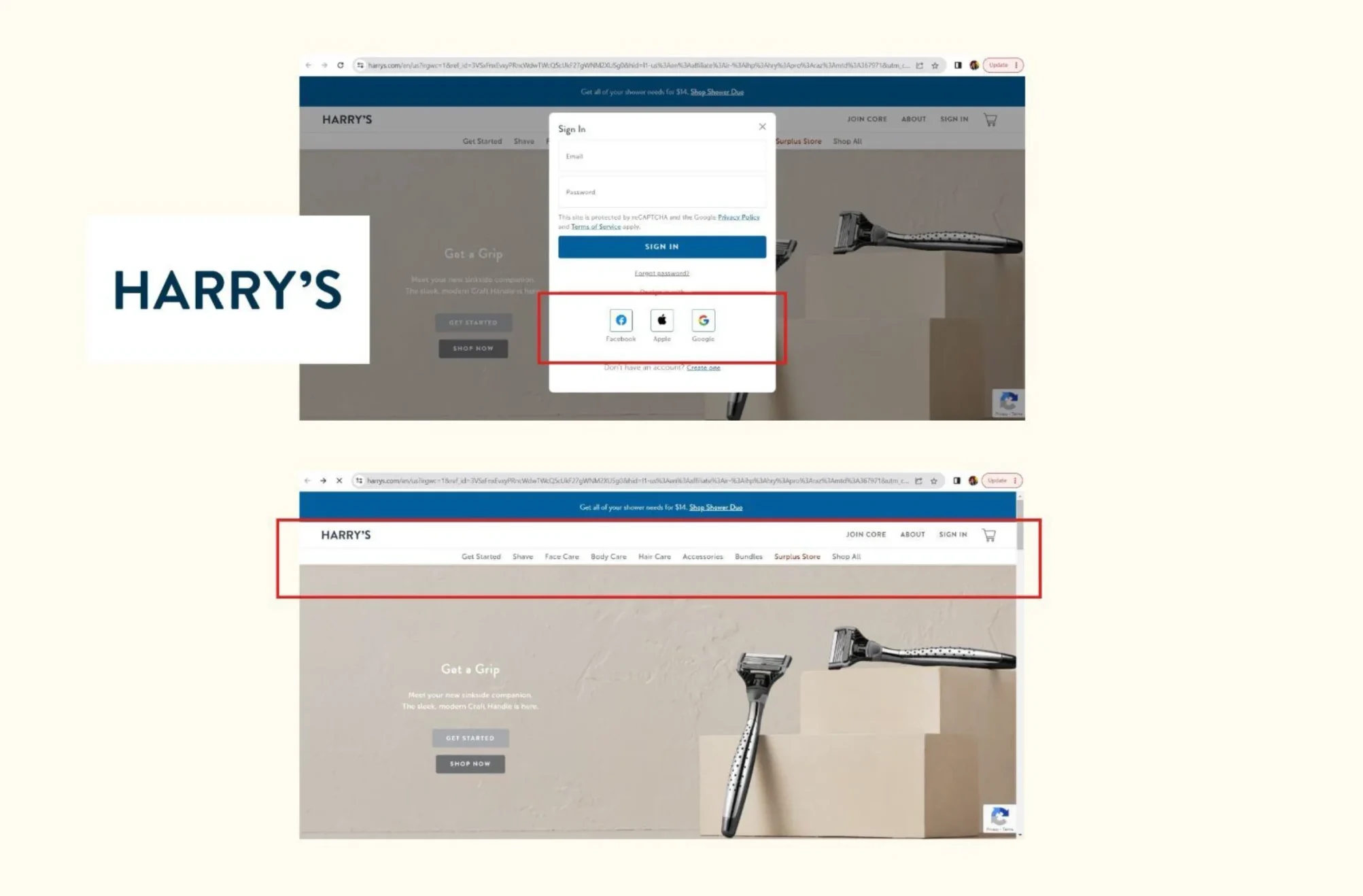
Dollar Shave Club (DSC) disrupted the shaving market in 2012 with a direct-to-consumer subscription model, challenging industry giant Gillette. By offering affordable, high-quality razors and grooming products, DSC quickly grew to over 3.5 million members and $200M in revenue by 2016. While the company’s growth was strong, my research highlighted friction in the subscription process. Many users didn’t want to spend time filling out forms, and options like autofill or simplified sign-ups were limited. For example, the previous website included a “Sign in with Facebook” option, which later disappeared, creating unnecessary hurdles. Additionally, product discoverability could be improved to attract and retain more customers. These insights informed opportunities to refine the experience and design a smoother, more user-friendly flow.
Key Objectives
- Streamline the subscription process by reducing friction and offering quicker sign-up options.
- Improve product discoverability to increase customer engagement and retention.
- Identify and address usability gaps in the flow, ensuring a smoother experience.
- Support DSC’s growth by creating a subscription journey that feels simple, intuitive, and user-friendly.
First survey round result
What I learned from the round one survey was that users found it time-consuming, confusing, and difficult to locate specific items and complete the subscription process. They expressed dissatisfaction with the website’s lack of user-friendliness. Participants highlighted the need for a quicker order placement and sign-up process. Their suggestions included the implementation of a search tool, improved categorization, and an additional platform for signing up. Overall, users described the website as basic, confusing, in need of improvement, and lacking organization.
Why Use Social Platforms to Sign Up?
Social login is a type of sign-on that allows users to log into a website by using the information stored on a social network, such as Google, Facebook, and LinkedIn, just to name a few examples.
It is also a substitute for the standard account creation, which makes sign-in and registration processes easier.
How does social login work?
Social login works by replacing the need to create a new account as a new user. Instead, you can use credentials from another account.
In this way, it removes the need to remember different passwords for different websites.
Given how many users indicate they prefer social login, giving people the option to register using their social account IDs rather than a registration form is more likely to increase user engagement.
9 Reasons why you should implement social login:
- 1. 86% of users report being bothered by having to create new accounts on websites
- 2. 77% of users believe social login is a good registration solution
- 3. 92% of users will leave a site instead of resetting or recovering login info
- 4. 88% of users admit to entering incomplete or incorrect data on registration forms
- 5. 100% of the Blue Research poll participants reported receiving irrelevant information and promotions
- 6. 78% of people say they’ll post messages to their social network about products and services they like
- 7. Better data means (potentially) better marketing decisions
- 8. 82% of users said they’d consider trying a new product if someone in their social network recommended it
- 9. The next generation of social engagement
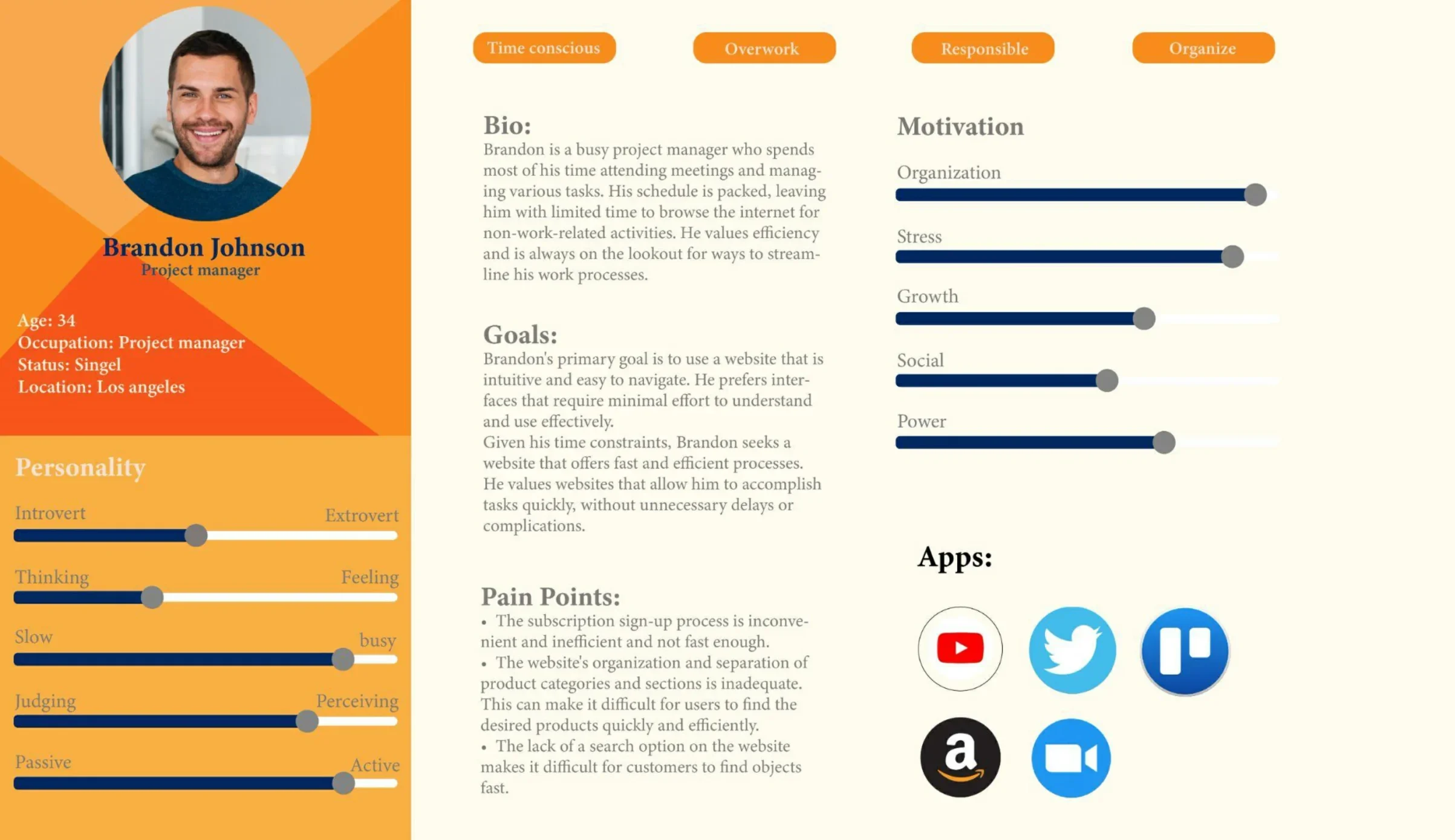
PERSONA
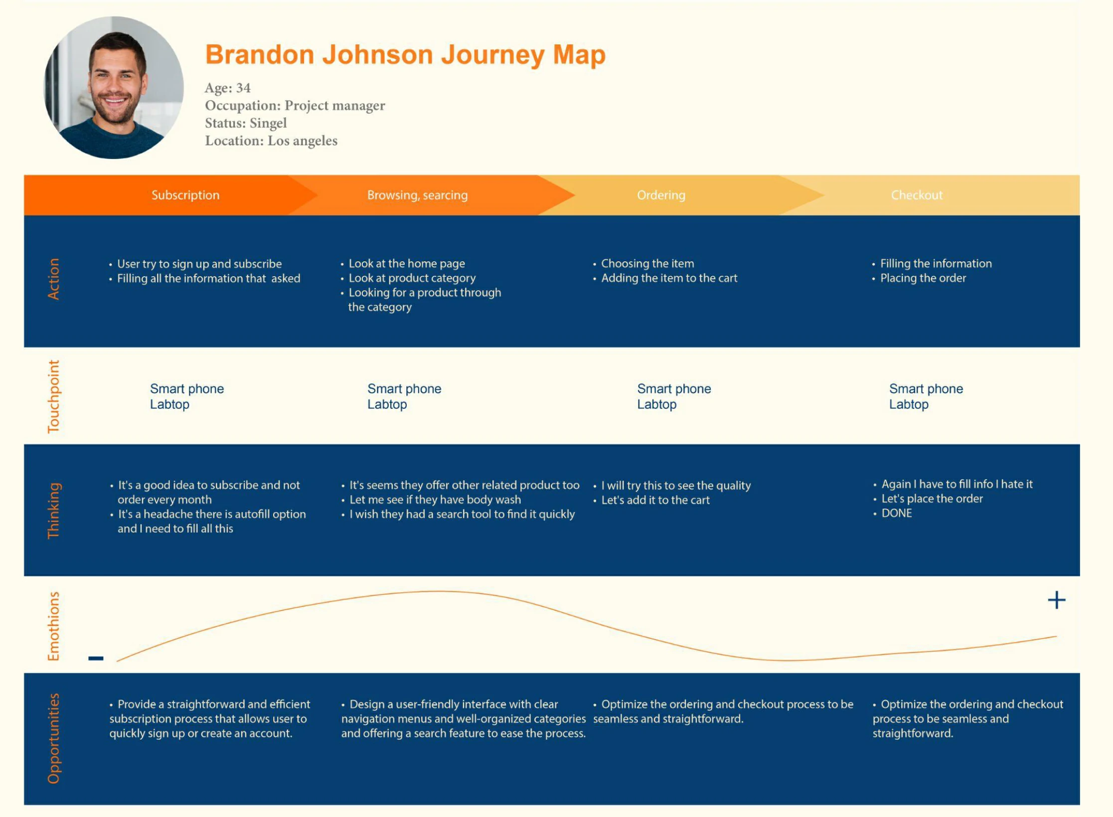
JOURNEY MAP
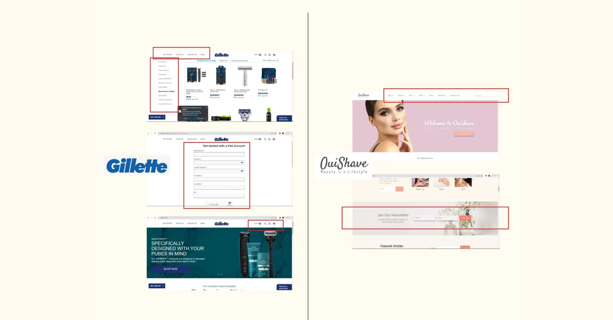
COMPETITIVE ANALYSIS
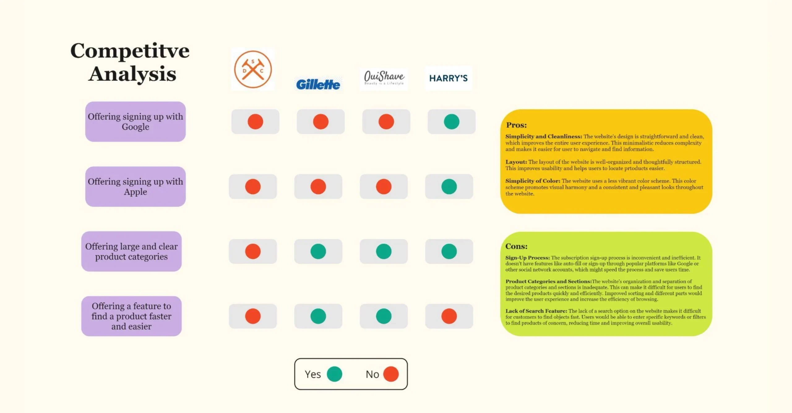
pross
Simplicity and Cleanliness: The website’s design is straightforward and clean, which improves the entire user experience. This minimalistic reduces complexity and makes it easier for users to navigate and find information.
Layout: The layout of the website is well-organized and thoughtfully structured. This improves usability and helps users to locate products easier.
Simplicity of Color: The website uses a less vibrant color scheme. This color scheme promotes visual harmony and a consistent and pleasant look throughout the website.
Cons
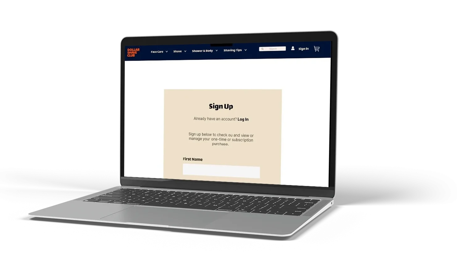
Sign-Up Process: The subscription sign-up process is inconvenient and inefficient. It doesn’t have features like auto-fill or sign-up through popular platforms like Google or other social network accounts, which might speed the process and save users time.
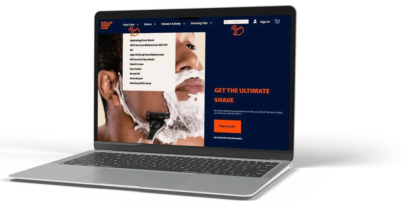
Product Categories and Sections:The website’s organization and separation of product categories and sections is inadequate. This can make it difficult for users to find the desired products quickly and efficiently. Improved sorting and different parts would improve the user experience and increase the efficiency of browsing.
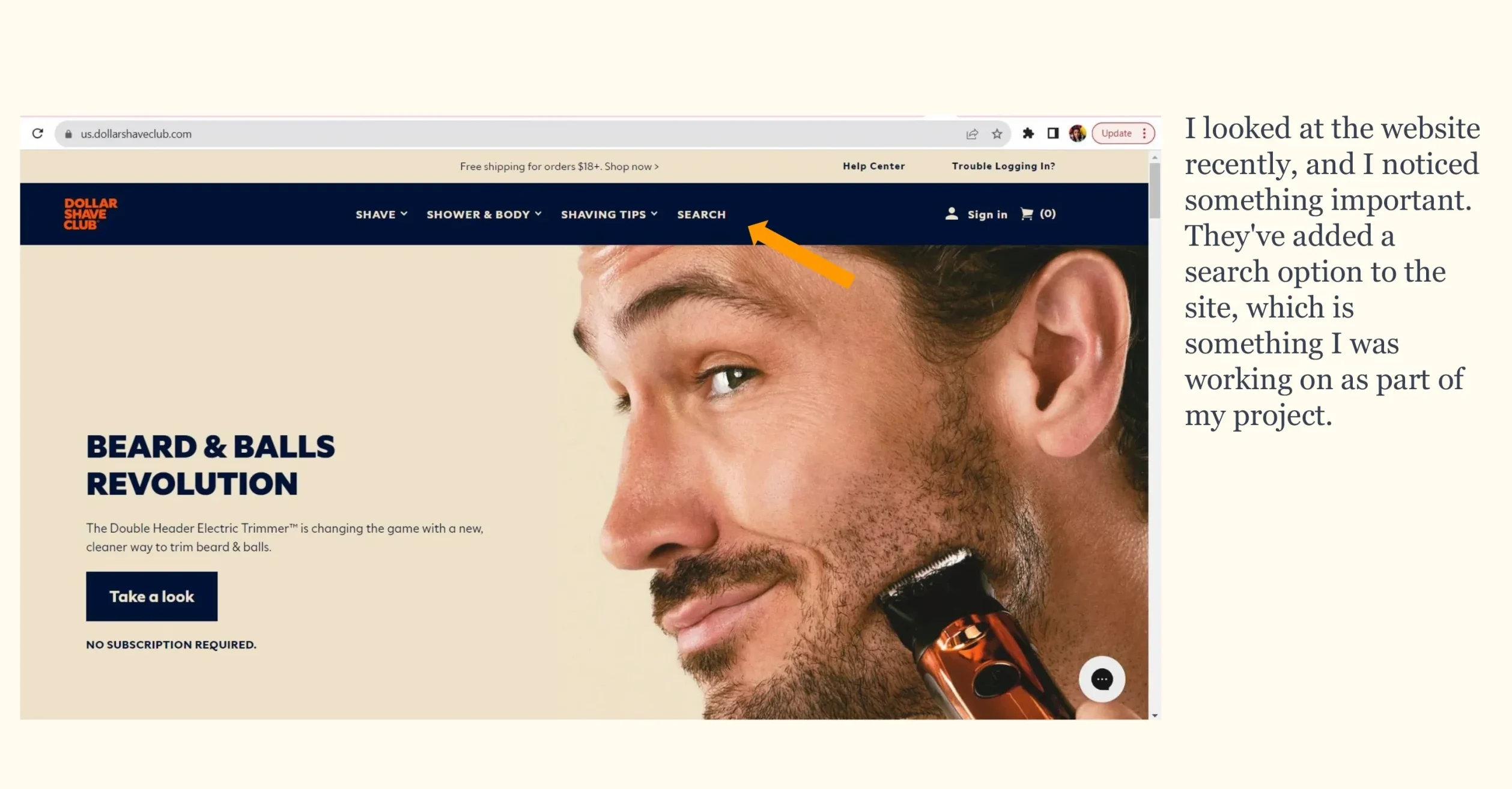
Lack of Search Feature: The lack of a search option on the website makes it difficult for customers to find objects fast. Users would be able to enter specific keywords or filters to find products of concern, reducing time and improving overall usability.
COMPETITIVE ANALYSIS
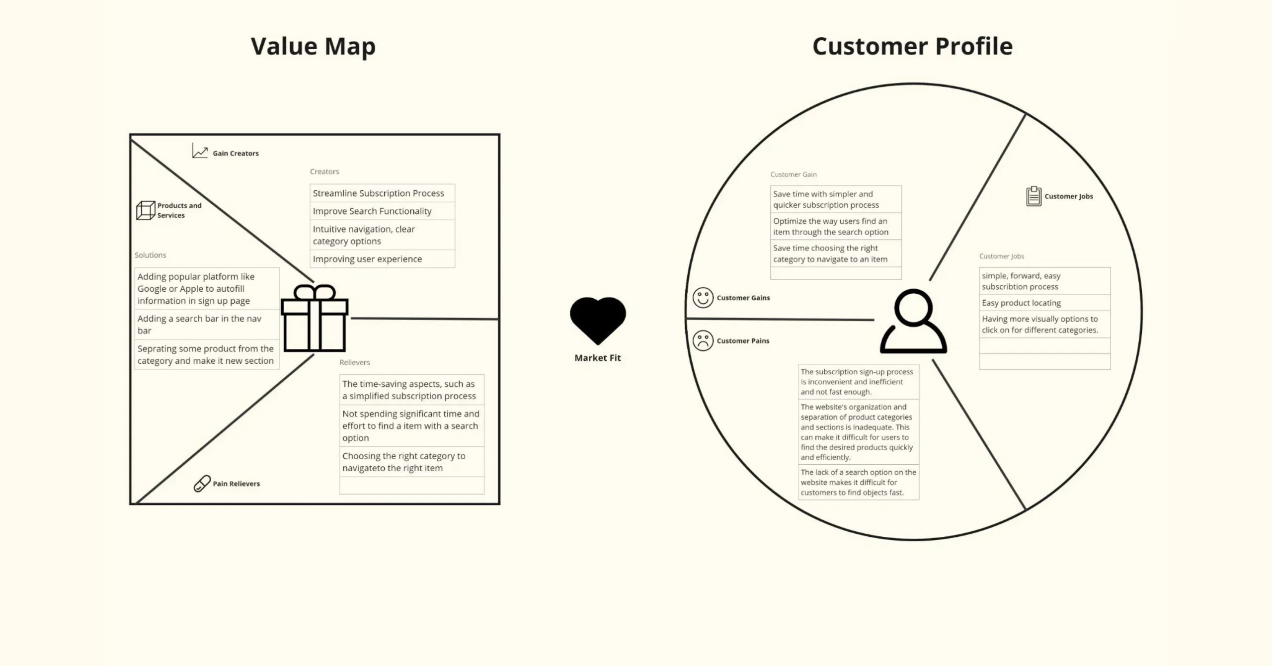
VALUE PROPOSITION MAP
IDEATION
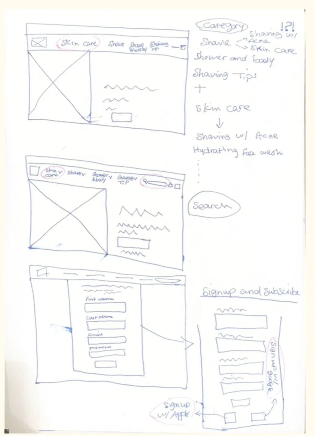
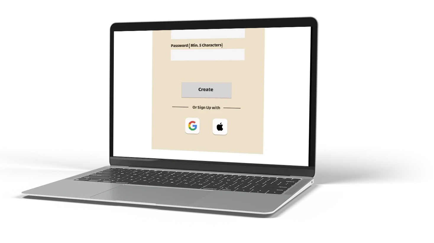
LO-FI PROTOTYPE
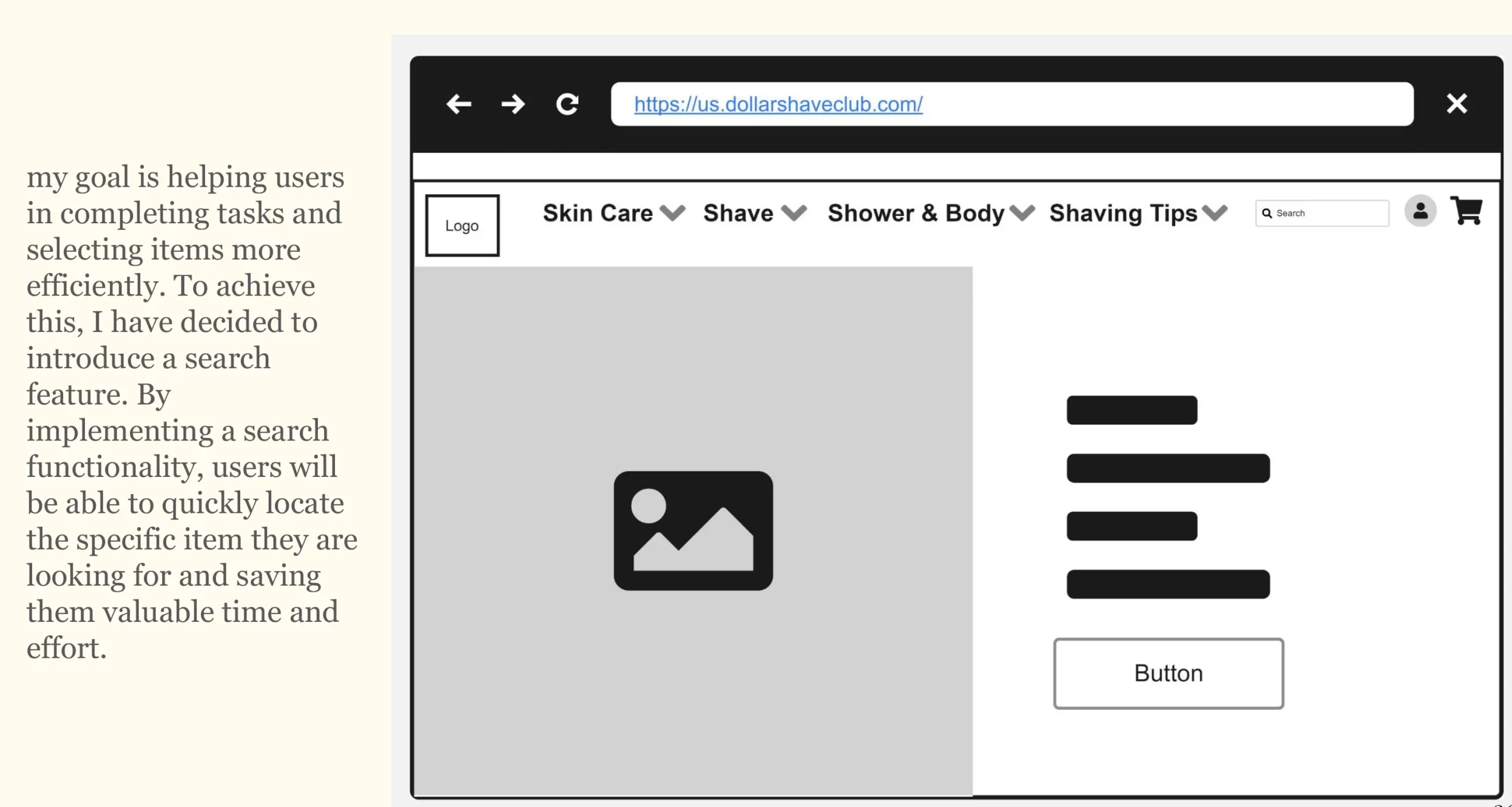
MID-FI PROTOTYPE
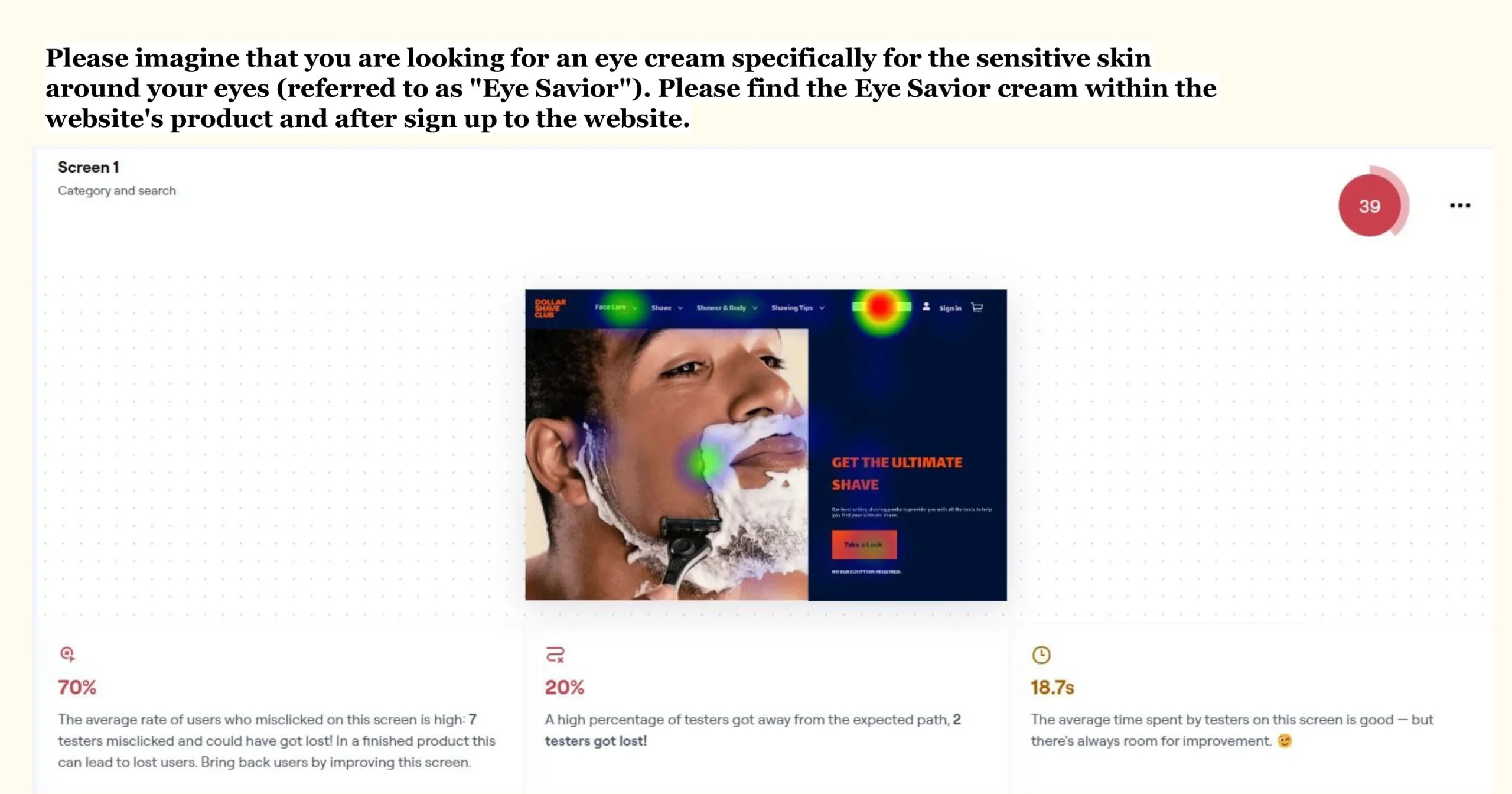
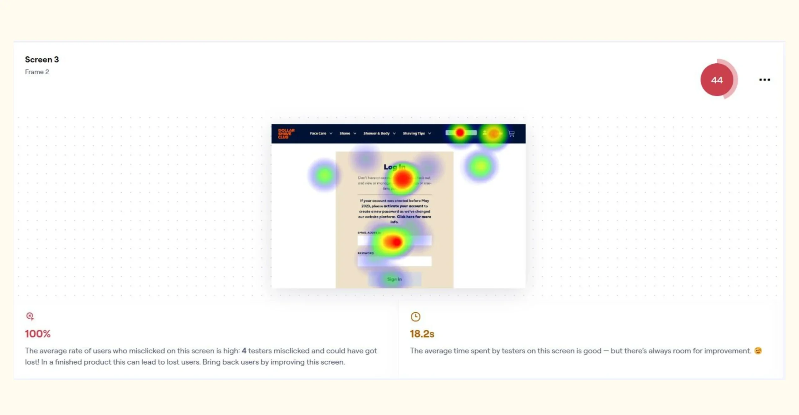
USABILITY TESTING
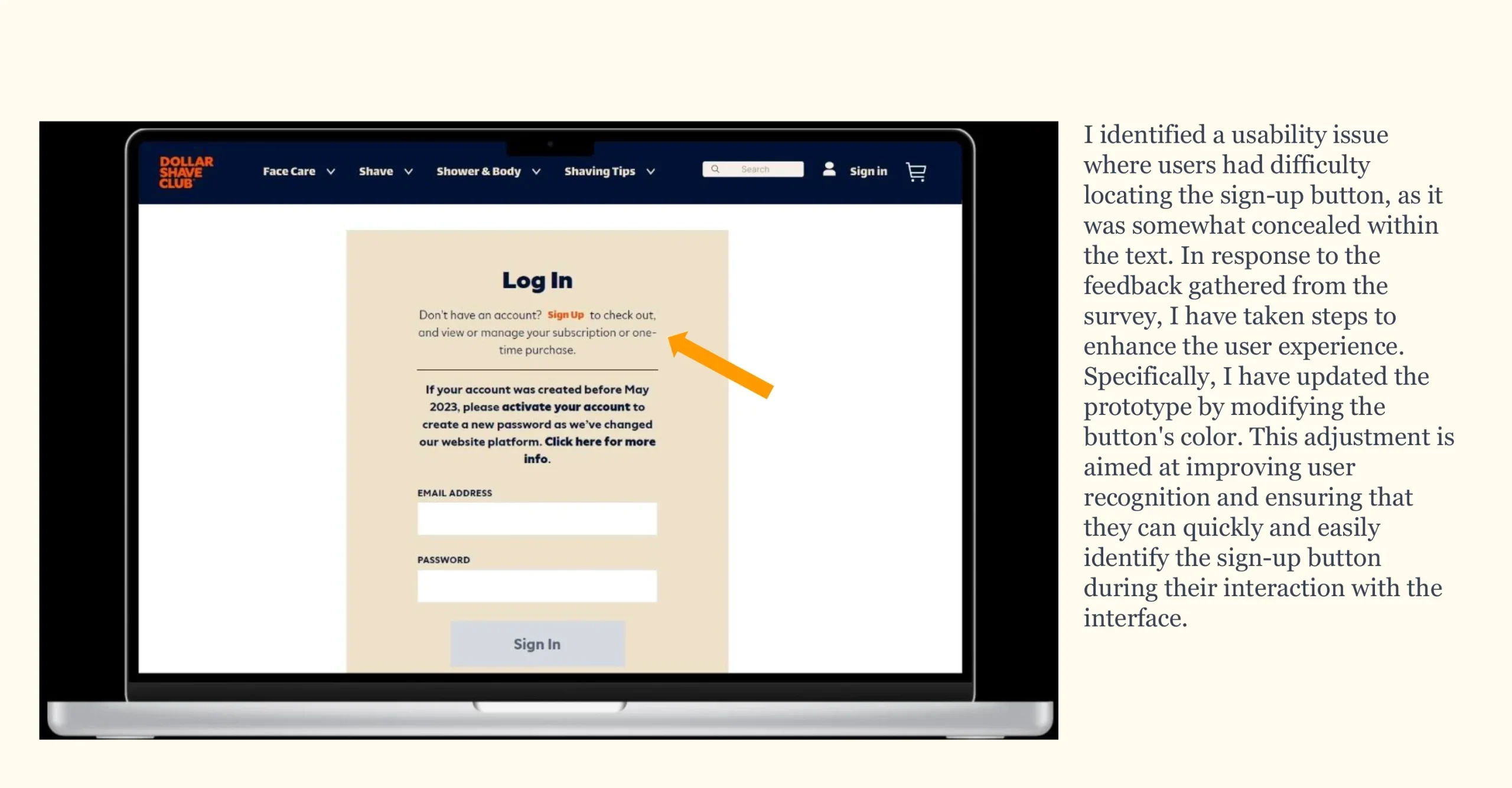
MID-FI PROTOTYPE UPDATE
Conclusion
Improving the user experience is an ongoing, iterative process. While the prototype addressed key issues like smoother subscriptions, better navigation, and clearer product discovery, follow-up surveys revealed continued challenges in the sign-up flow. This highlights the importance of consistent testing and user feedback to refine the design. Moving forward, aligning the subscription process more closely with user expectations will be essential for creating a seamless and enjoyable experience.